New Website for
Rødne Fjordcruise

Project Description
Rødne Fjordcruise is a company that offers experiences on the fjord. They needed a new website with improved user-friendliness and a visual upgrade, in addition to the maintenance and support of the site.

The project included user testing, work meetings and workshops, creating sketches and prototypes, and developing the final website.

The completed site can be viewed in its entirety atrodne.no
My Role
UX Designer. I led user testing and workshops, ensuring that the insights shaped the final design. I also created prototypes and collaborated closely with developers to refine the booking flow

The team consisted of two UX designers and two developers.

Tools: Figma, Trello, and Google Drive. The website was built in WordPress.

Grensesnitt AS
UX Design, development and maintenance
December 2023 - June 2024

Rødne Fjordcruise offers experiences on the fjord and wanted a visual upgrade and improved user-friendliness for their website. Based on inquiries to customer service, they suspected that the website's usability had room for improvement. The typical users of the website are tourists from anywhere in the world looking to book a trip, usually doing so only once in their lifetime. Since we knew most users would book on their phones, we followed the mobile-first principle.

We’ve received feedback from the client that users find it easy to navigate, and booking numbers have not decreased since its launch in June 2024.

User testing

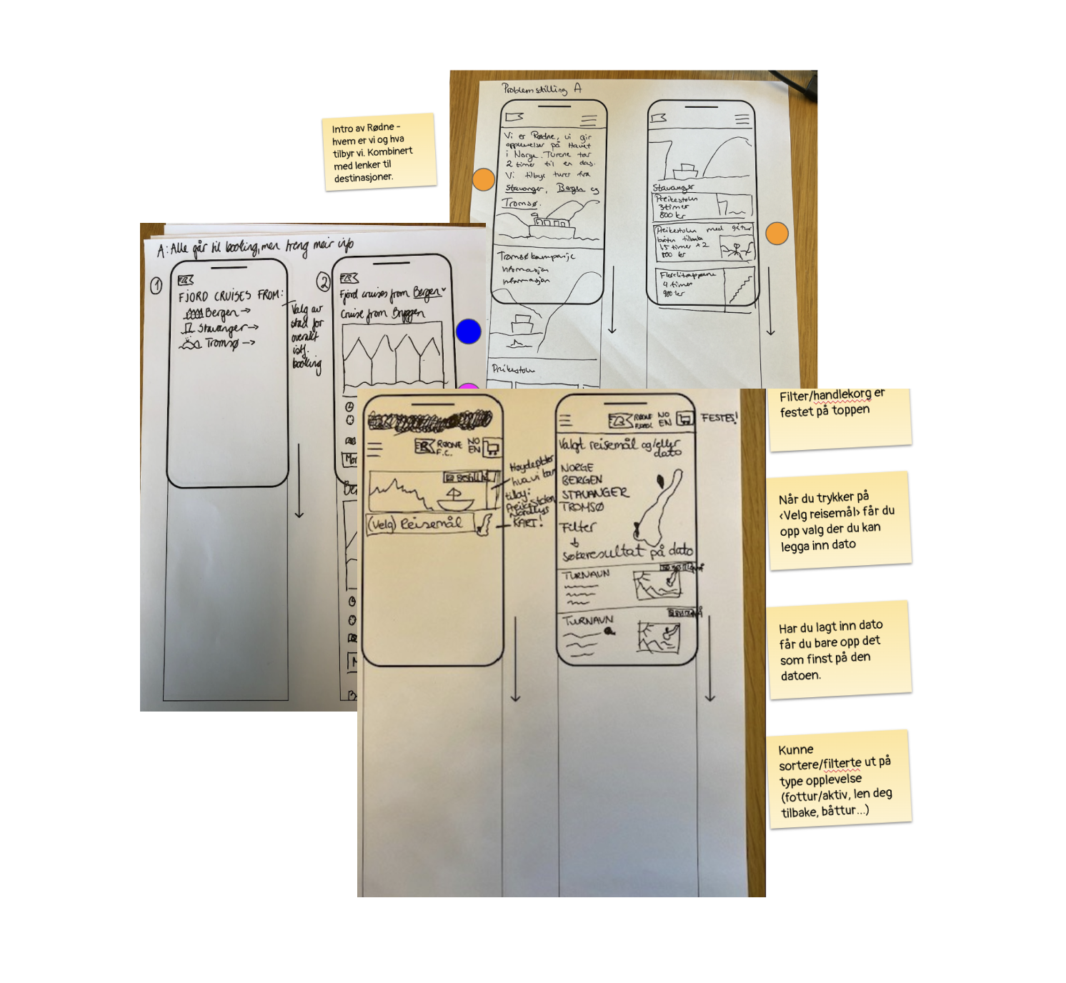
To verify the assumptions about the issues, we conducted a user test with six participants from different countries. They stated that they enjoy traveling and had not been to Norway before.

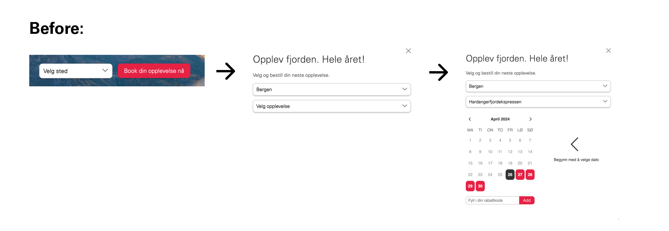
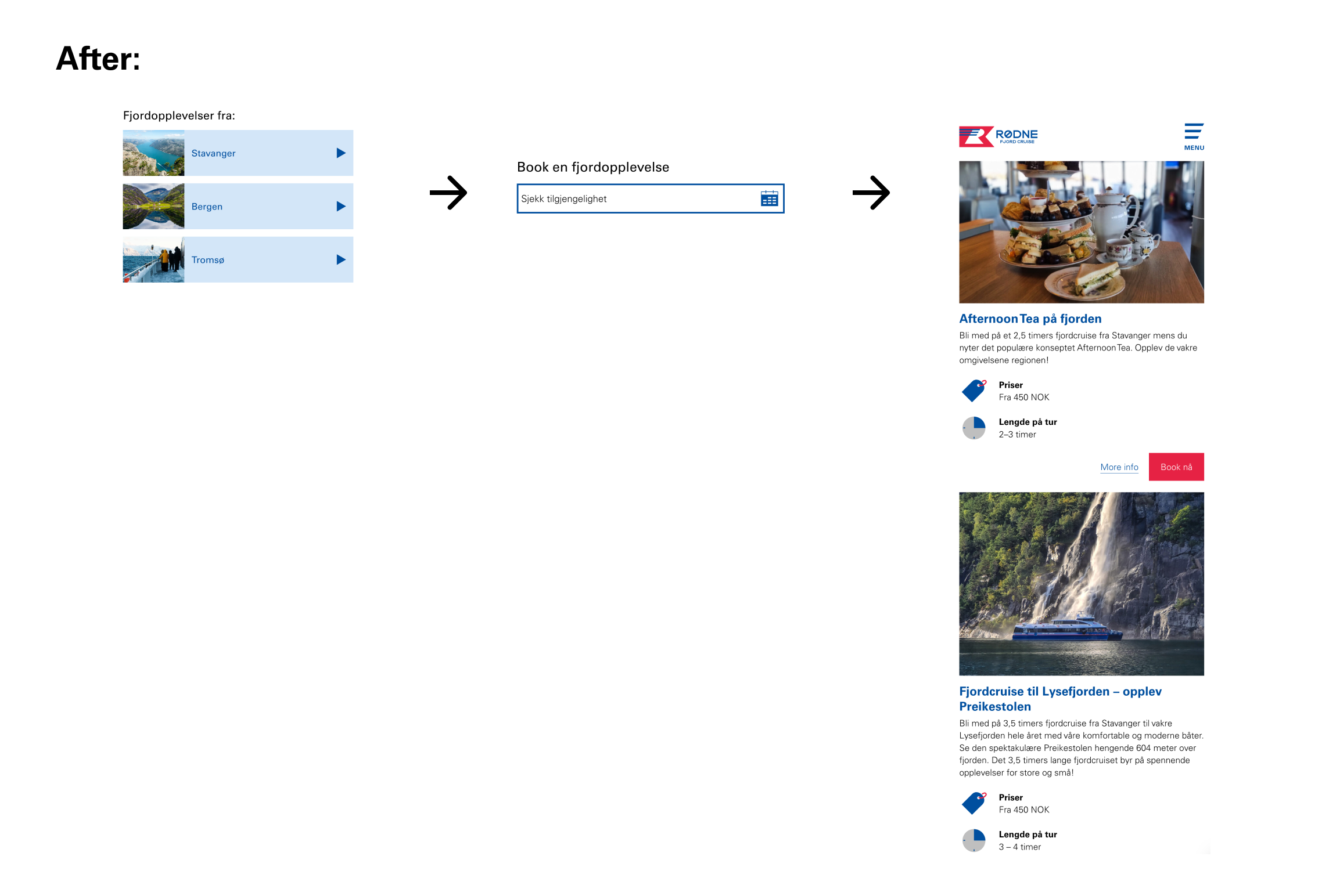
We found that all six participants expected to see more information about the tour but were instead taken directly to the booking page. Additionally, they needed to know the name of the tour to find the correct one.

Workshops

After analysing the result of the user tests, we had an extensive work meeting with the client that included exercises to find effective solutions for a smooth booking process. We conducted several workshop exercises, including sketching ideas for the homepage and booking flow, and then voted on the idea we liked best. We then used this to create digital sketches in Figma.

Hand sketches from a workshop done on paper.

Wireframes and a new booking flow

The solution for the booking process was to base it on the departure location for the trips offered by Rødne, as we also noticed that the test participants did not have a strong enough familiarity with Norway to understand the relative locations of Stavanger, Tromsø, and Bergen. We were also made aware that the participants were more interested in what was available while they were in Norway, rather than the type of tour they were going on. Therefore, we revised the flow to start with the destination, followed by date availability. By restructuring the booking process based on user needs, we reduced confusion and ensured a smoother experience.
Screenshot of the old booking flow showing a dropdown menu with a label called "pick place", then an arrow to a new screenshot that shows two drop down menu, one with the destination and one with the name of the trip. Then there's an arrow to the last screen, that show's a date picker that looks like a calendar.Screenshots showing the new booking flow. First a screen with three destinations formed as buttons with a small picture from the city: Stavanger, Bergen and Tromsø. Then an arrow to a new screen shot that shows some information about the city, and then a date picker where you can choose the a time line. Then an arrow to a screenshots that lists out the available trips for that time period, including pictures of the cruise and key information, such as price and duration.

Additional improvements:

  • Clearer departure locations: Many foreign users were unfamiliar with Norway’s geography, making it unclear that Rødne operates from three separate cities. We added a map to clarify this and prevent misunderstandings.
  • Improved language selection: The website initially defaulted to Norwegian, requiring users to manually switch languages. We made the language selector more prominent and set English as the default for non-Norwegian browsers.
  • Simplified FAQ: The original FAQ-page required users to open a new page for each answer, making navigation cumbersome. We redesigned it with categorized links that scroll to the correct section, using dropdowns and city-specific buttons to reduce confusion.